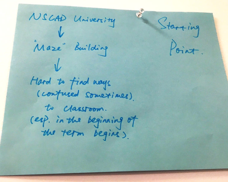
This project is originally related to NSCAD University, which is the place that I did my master’s program. To me, this project is very interesting, it reminds me of that place, makes me rethink it and generate brand new ideas based on this unique place.
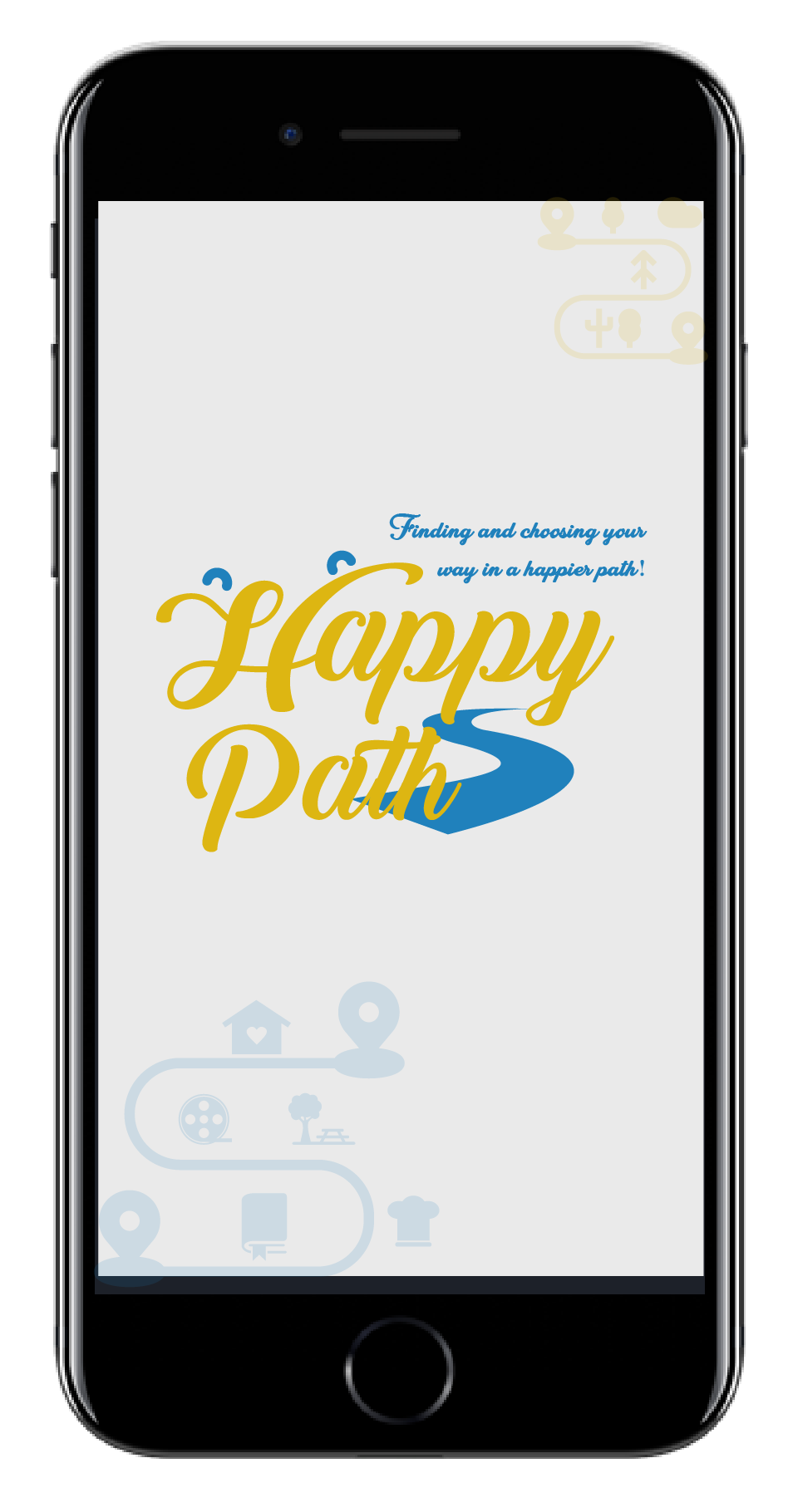
Let us go back to NSCAD University itself. It was not that easy to find the way to classrooms at the beginning of semesters for students. Why? Because the entire building is like a maze! In fact, this “maze” idea inspired me to this project. I wanted to create something that let people find and choose happier paths to get where they’re going. The “Happy Path” is coming!
Card Sorting
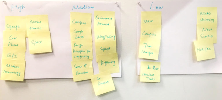
Day 1 - What is important for you to find ways?
Before I started developing the idea of “happy path”, I was quite curious about how people find their ways. In other words, what features or tools do they prefer to use for way finding. The results did not surprise me, most people are very reliant on cellphones or GPS to find routes. It is quite common nowadays, since everybody has smartphones; ancient tools such as compasses seem hard to use, especially for young people.
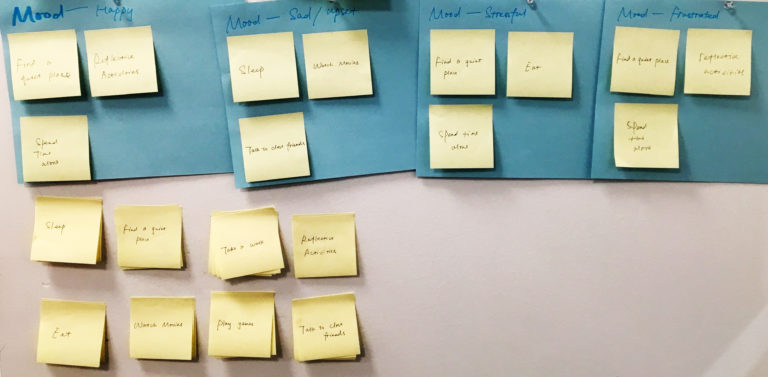
Day 2 - What do you like to do in different moods?
The second day I tried to figure out how people deal with their mood, what things do they prefer to do when they have diverse emotions. This time, I found different results. In fact, when I talked to each person and found out how they make decisions about what direction to take, I realized the choices they made are normally according to their personalities and habits.
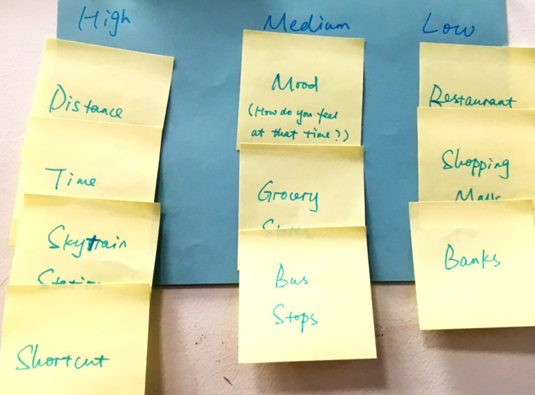
Day 3 - What affects your way choosing?
The third day I did card sorting about factors that influence people to choose their routes. Transportation, time, and distance are the three top factors that matter to most people. Other factors are not crucial to them unless they have related schedules. Based on these results, I actually felt a little confused and doubtful. Because suddenly I realized there is no clear connection between mood and path choosing.
Research
Colors
"
Red, orange and yellow are next to each other on the wheel and are all warm colors. Warm colors often evoke feeling of happiness, optimism and energy.
Cool colors include green, blue and purple. Cool colors are usually calming and soothing but can also express sadness.
"
"
It is important to note that colors can be subjective – what might make one person feel cheerful can make other person feel irritated depending on the viewers’ past experiences or cultural differences.
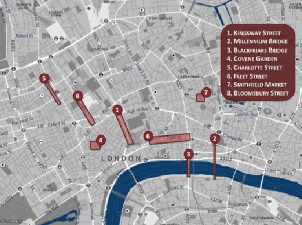
Happy Maps
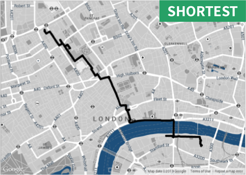
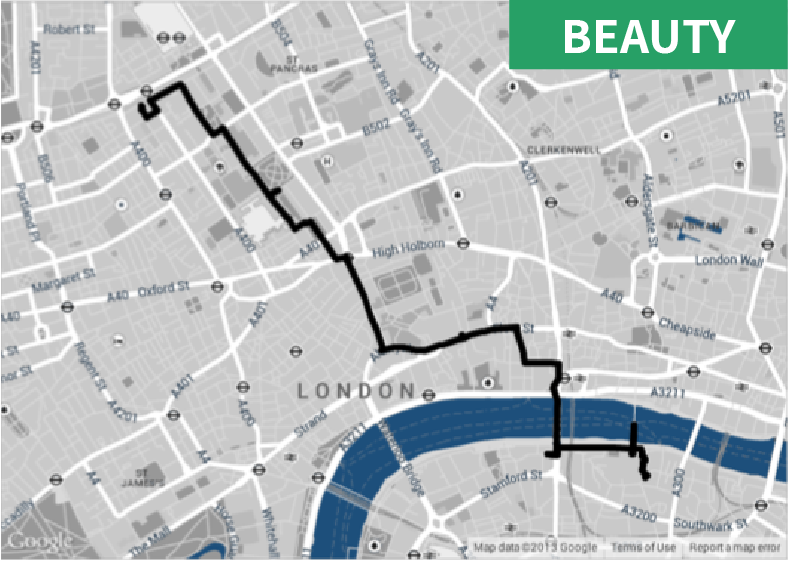
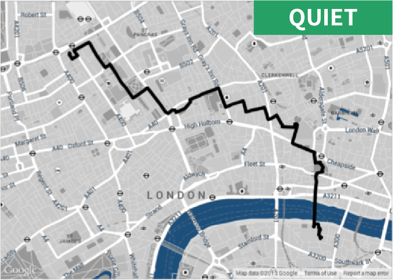
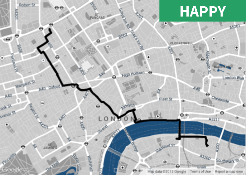
Figure 1
Map of London with Eight Frequently MenTioned Places
"
Our participants will see the four paths, like the ones shown in Figure 1, on a web page but do not know which one is what. The two end points of the paths are Euston Square and Tate Modern. We chose those two specific points because the resulting paths: 1) are between two locations well-known to Londoners; 2) are in central London, and that increases the chance participants will know them; 3) are at walking distance; and 4) go across the River Thames, allowing us to test any potential effect of the mental divide between North and South London.
The Shortest path to happiness: recommending beautiful, quiet, and happy routes in the city
"
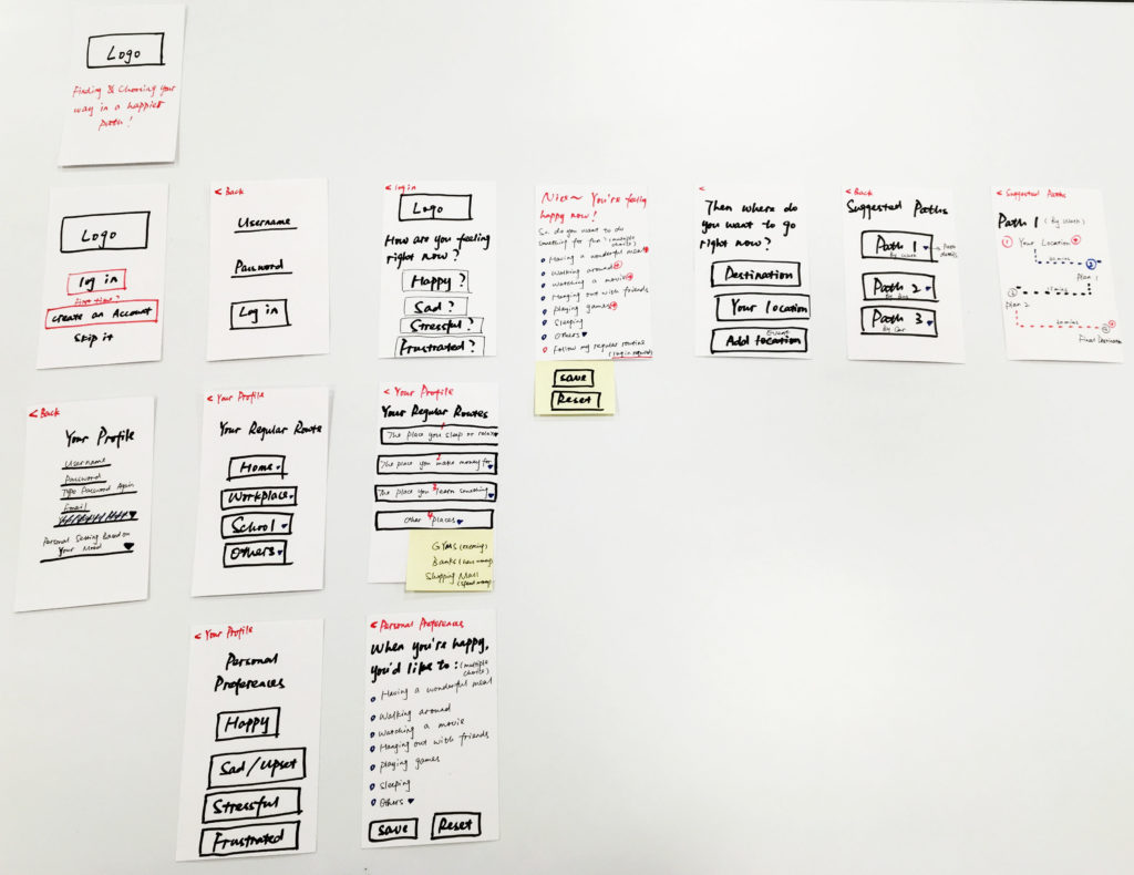
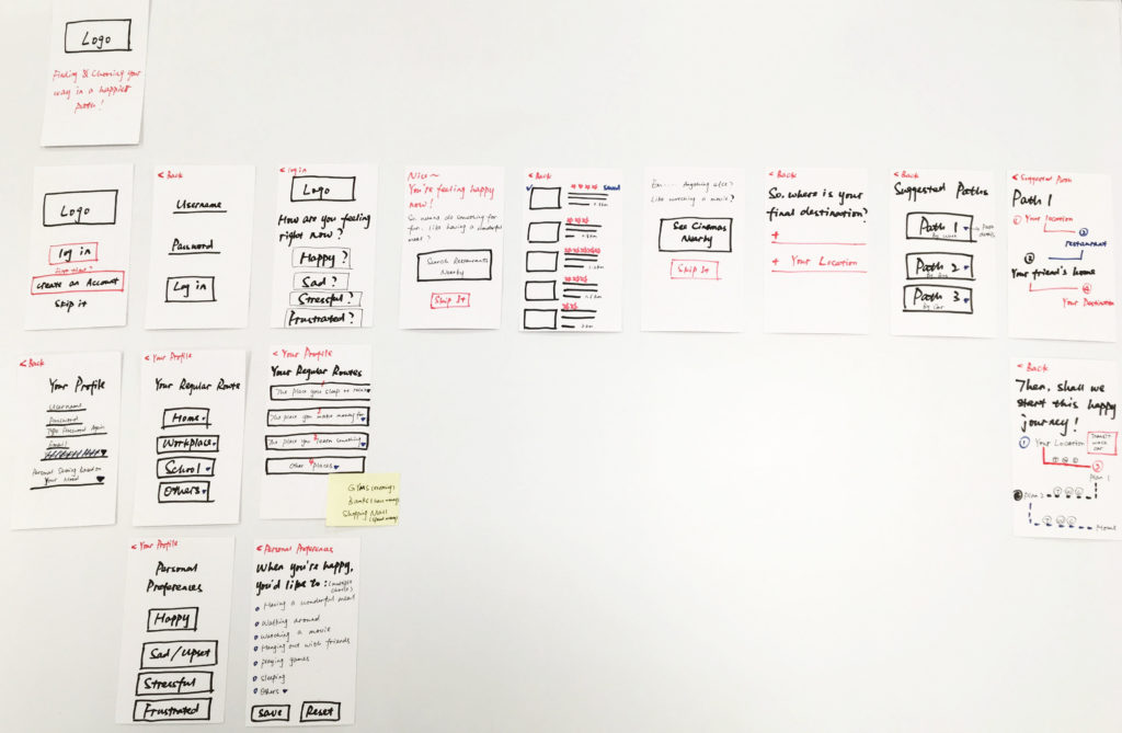
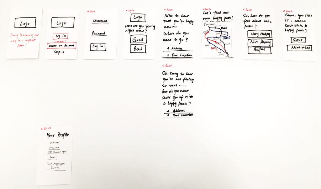
Paper Prototyping
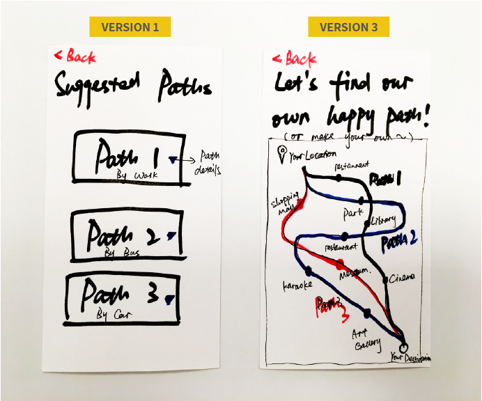
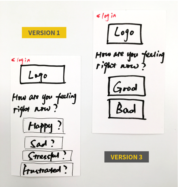
Version 1
Version 2
Version 3
The three paper prototype versions are very different. Compared to version three, the first two are a little complicated. After several tests with my participants, I realized some steps are not necessary. Therefore, the final version shrank down to version three.
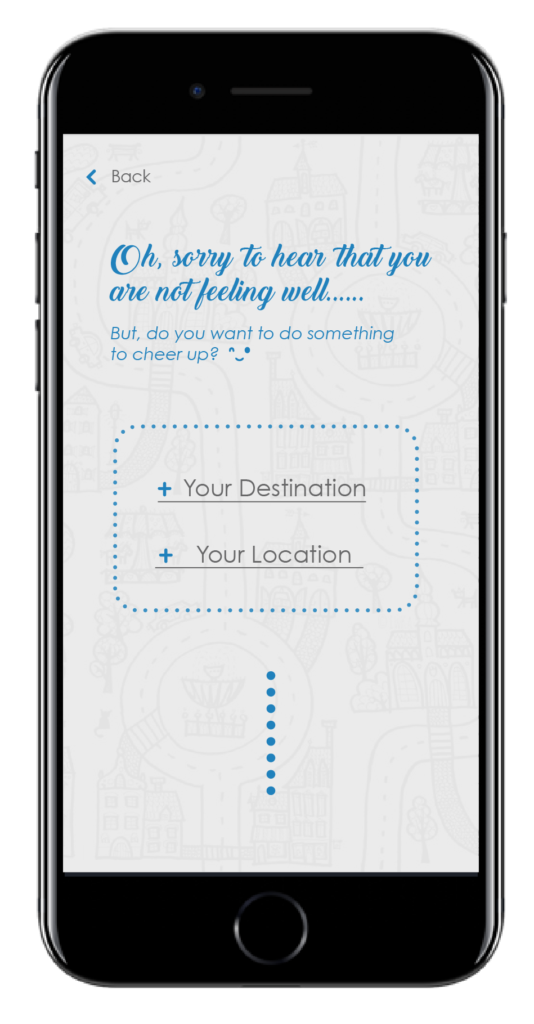
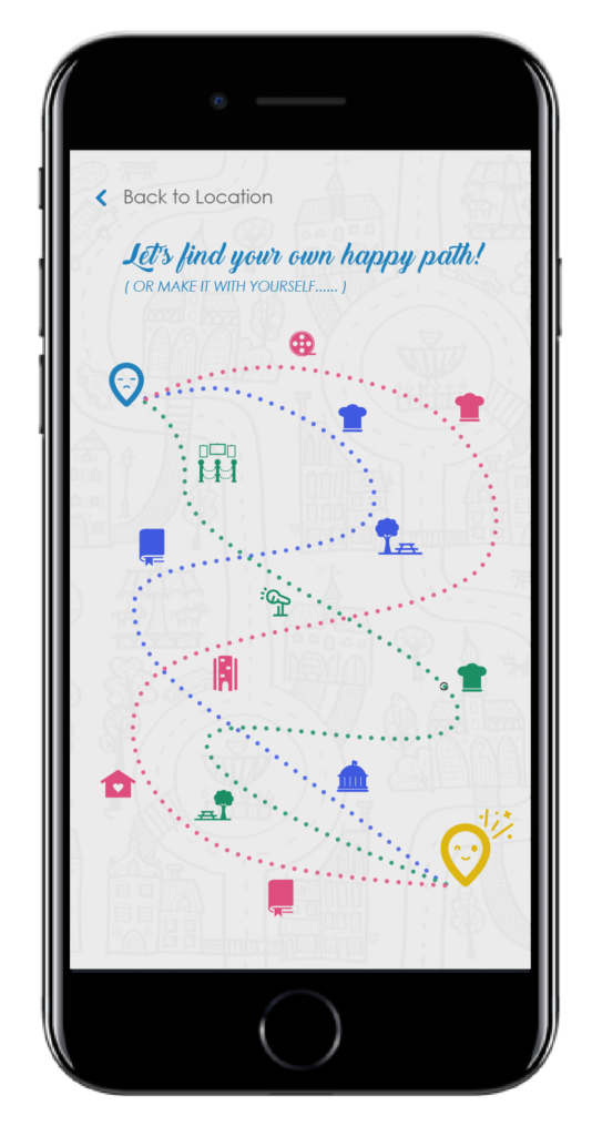
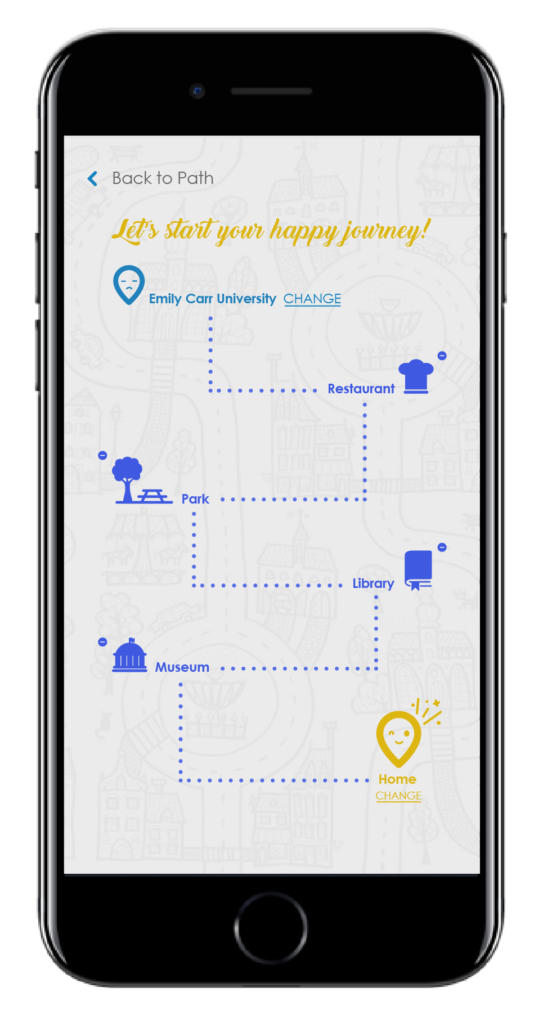
Suggested Paths Page
At the beginning, I created paths only by different types of transportation. But during the testing process, I found there is no direct connection to mood. Thus, based on the feedbacks that I received, I designed them by various factors that may make people happy.
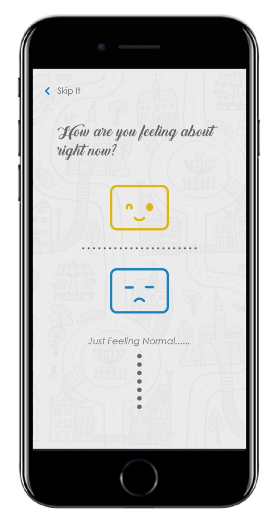
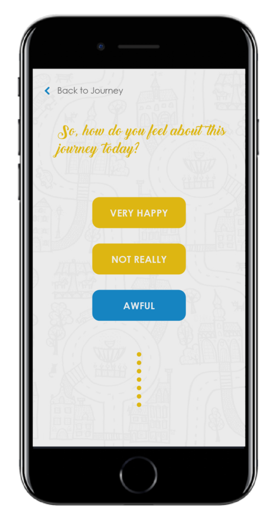
How Are You Feeling Page
Originally, I designed four diverse emotion settings in this application to users. However, during the process of prototyping, I found participants may not always have a very specific feeling. In this case, I changed this step to suggest just two moods: feeling good or feeling bad.
branding
logo development
Version 1
version 3
Version 2
Version 4
final version
color scheme
app design
my account
mood checking
address setting
path choosing
path adjustment
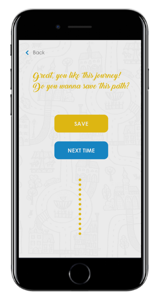
path rating
path saving
What I Learned
This is a very interesting project to me, especially when I had this inspired concept from the start. However, after I did several rounds of card sorting and paper prototyping with my participants, I found that it was hard to connect way choosing with mood directly. Moreover, some processes I designed were not that necessary to users. Therefore, through this project, I realized the more testing from participants we did, the more accurate results we may get. Only in this case, can I easily design an app that is truly approachable to our potential users.